How To Turn More Impressions Into Downloads with A/B Testing on Google Play

When it comes to getting more downloads the first thing everyone thinks about is promotion — get the app in front of more people — but that's only half of the equation.
The other half, which is as important but often neglected, is what percentage of those that see the app actually downloaded. That's called the app store conversion rate and is calculated by dividing the number of downloads your app had in a given time period by the number of impressions it had.
Why Conversion Rates Matters
Here's where this becomes critical. Getting more downloads for an app with a low conversion rate is going to require a lot more effort than for an app that has a high conversion rate.
For example, say you want to get 1,000 new downloads. If your app's conversion rate is 10%, you'll need 10,000 impressions. If your conversion rate is 25% however, you'll only need 4,000 impressions to get the same number of downloads. While these numbers are really simple and unrealistic, they make it very clear that conversion rates matter.
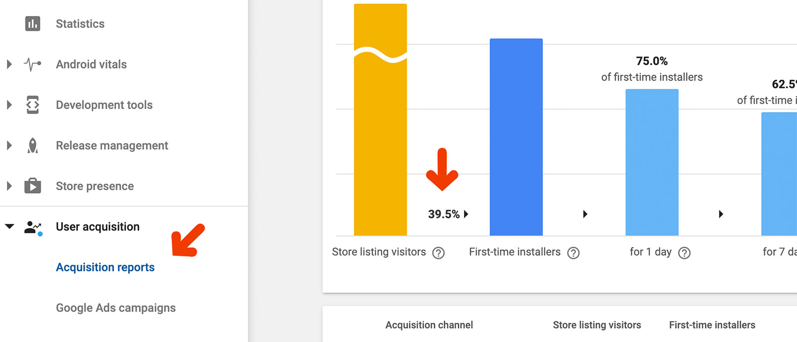
You can find your app's conversion rate in the User Acquisition reports:
Increasing Your Conversion Rate
Someone who sees your app for the first time makes the decision of whether download it or not very quickly. If they're not already familiar with the app or brand they'll use everything that's on the app store page to make that decision, which means elements such as the icon, text, screenshots, and videos are critical in turning an impression into a download.
To improve your conversion rate, you'll need to tweak those elements to fit your target audience as much as you can. This includes both applying best practices and also tailoring elements for your audience. But how do you know what works best for your users? You can use your intuition, but that's rarely enough (and in some cases even totally wrong).
That’s where A/B testing comes in.
What’s A/B Testing?
A/B testing is a formal method of measuring the likelihood that a change to an element will improve your conversion rate. It's done by splitting impressions into two groups, showing each different versions of the element being tested, and measuring the conversion rate of each separately. The better conversion rate wins.
Using A/B testing we can then easily find out which screenshots, colors, tone, etc. give the best conversion rate and highest downloads without having to guess.
Accelerate Your Downloads
Discover new keywords, monitor ranks, and snoop on competitors.
How To A/B Test on Google Play
Google Play has built A/B tests right into the platform, providing developers all the tools they need to run and measure the impact of A/B tests. Apple doesn't, so we'll focus on A/B testing with Google Play in this guide.
Choose One Thing to Test
Using Google Play you can test the icon, screenshots, video, short description, and long description.
You can test one element at a time but can run multiple tests concurrently, but we highly recommend that you don't and instead focus on one element. This way when downloads go up (or down) you can pinpoint the reason with certainty.
For most developers, the biggest gains will come from experimenting with screenshots, video, and sometimes short description. Screenshots are most popular both because they're the first thing new users look at, and also because they offer the most flexibility in terms of getting creative.
Once you've decided which element to test think about what kind of change you'd like to test. There's a good list of ideas below to get you started.
Set it Up Within the Google Play Console
You're now ready to start testing:
- Log into your Google Play Developer Console and find the Store Listing Experiments tab within the Store Presence group.
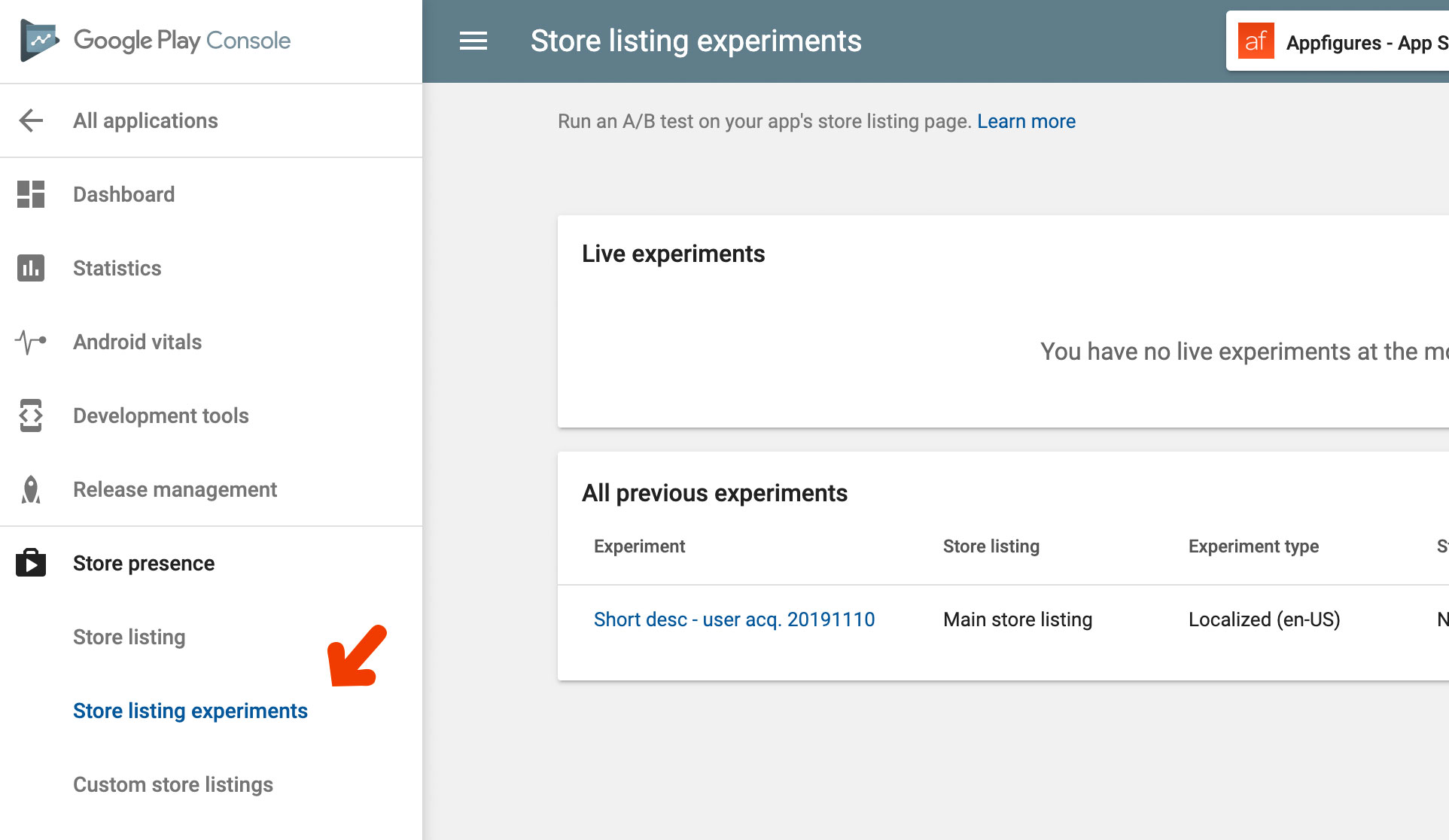
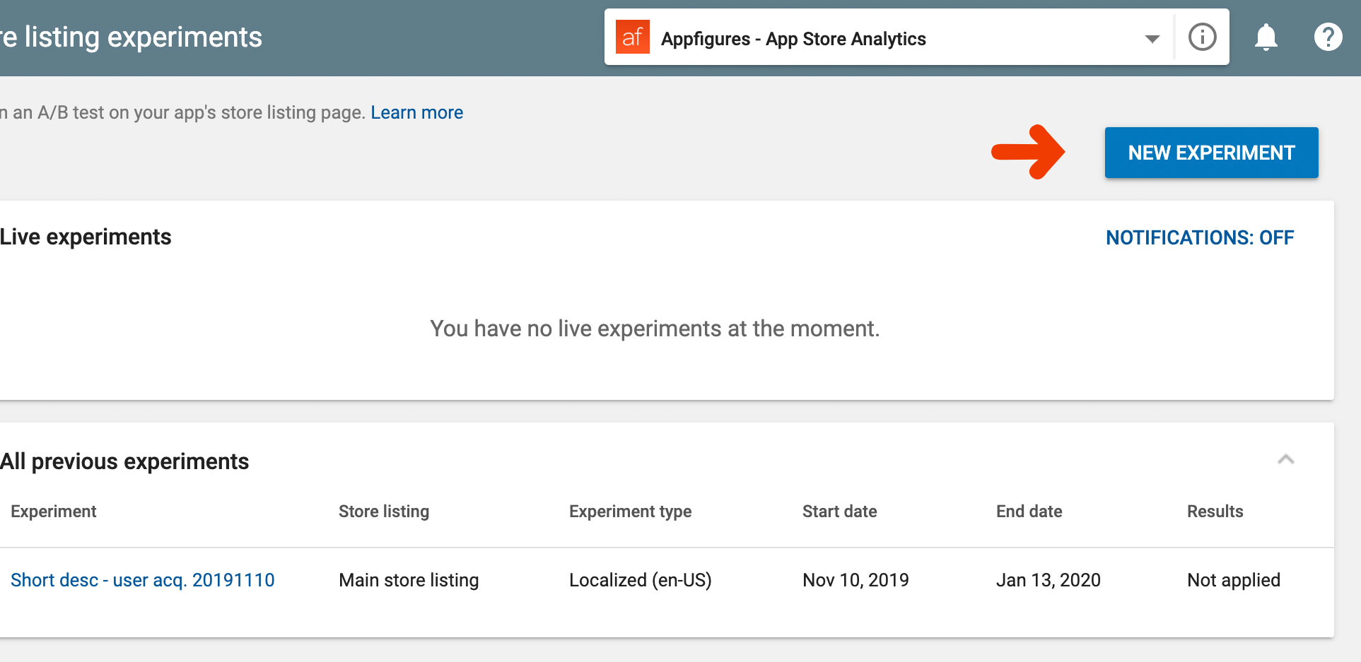
- Click the New Experiment button at the top right-hand corner of the screen to create a new A/B test
- Set up the basics as well as your targeting options.
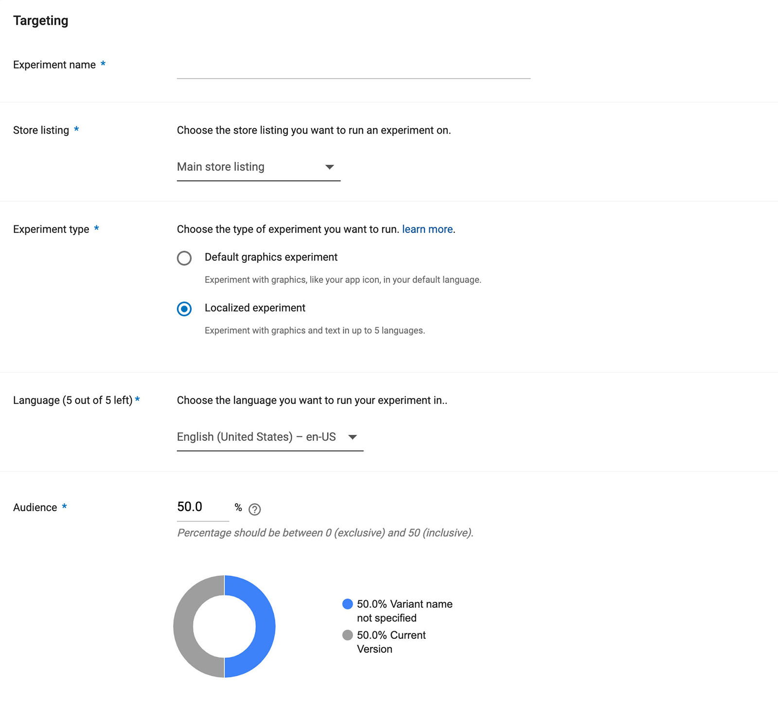
Experiment name - Give your test a description and unique name. A simple way to do that is to include the element being tested and the start date of the test (ex. "yellow-icon-20200101")
Store listing - Select the default "Main"
Experiment type - This part's a bit tricky unnecessarily, but here's the straightforward version: if you're testing graphics and aren't localizing select "Default graphics", otherwise select "Localized".
Language - If you selected a localized experiment, use this to select which language it will be shown to.
Audience - Select the % of impressions you'd like to see the new version of the element you're testing. We recommend letting as many users see it so you can get results faster, so leave this at the default value (should be 50%).
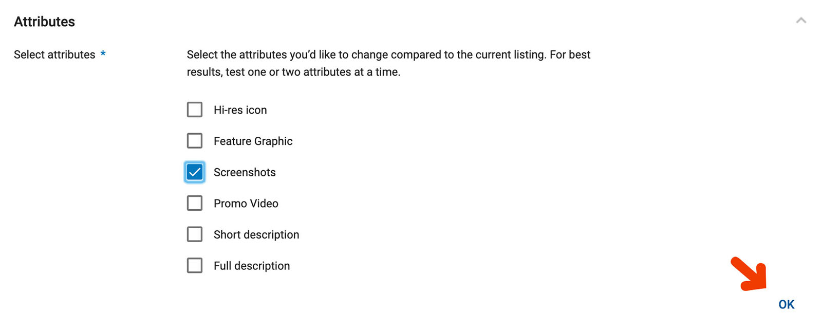
- Indicate which element you'd like to test. Again, we recommend sticking with one. Check the element and click the OK button below. Once you click OK the page will load the current version of the element.
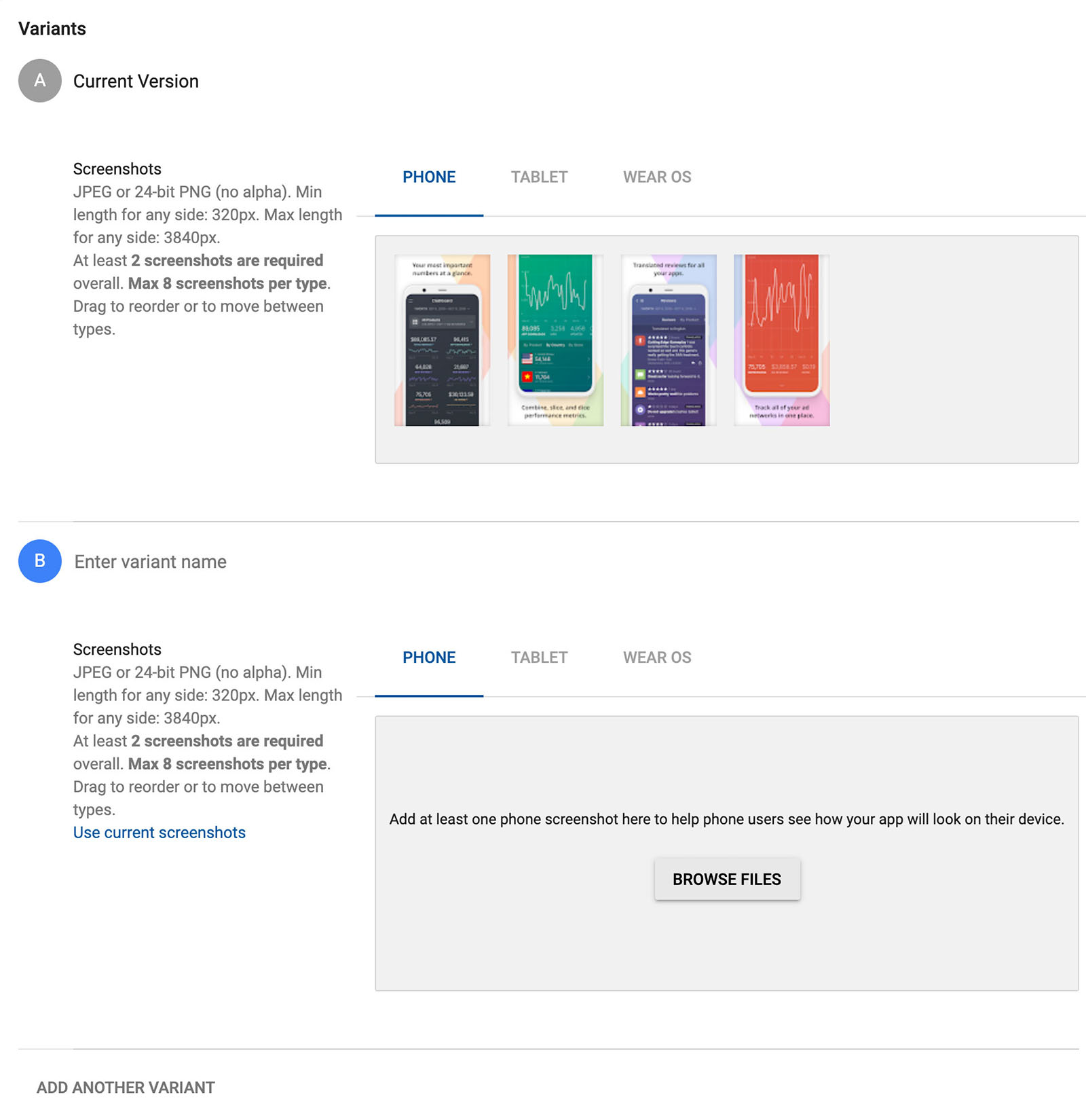
- Add the version of the element with the change you want to test. This will be different depending on what you've chosen to test. Here's what testing screenshots look like:
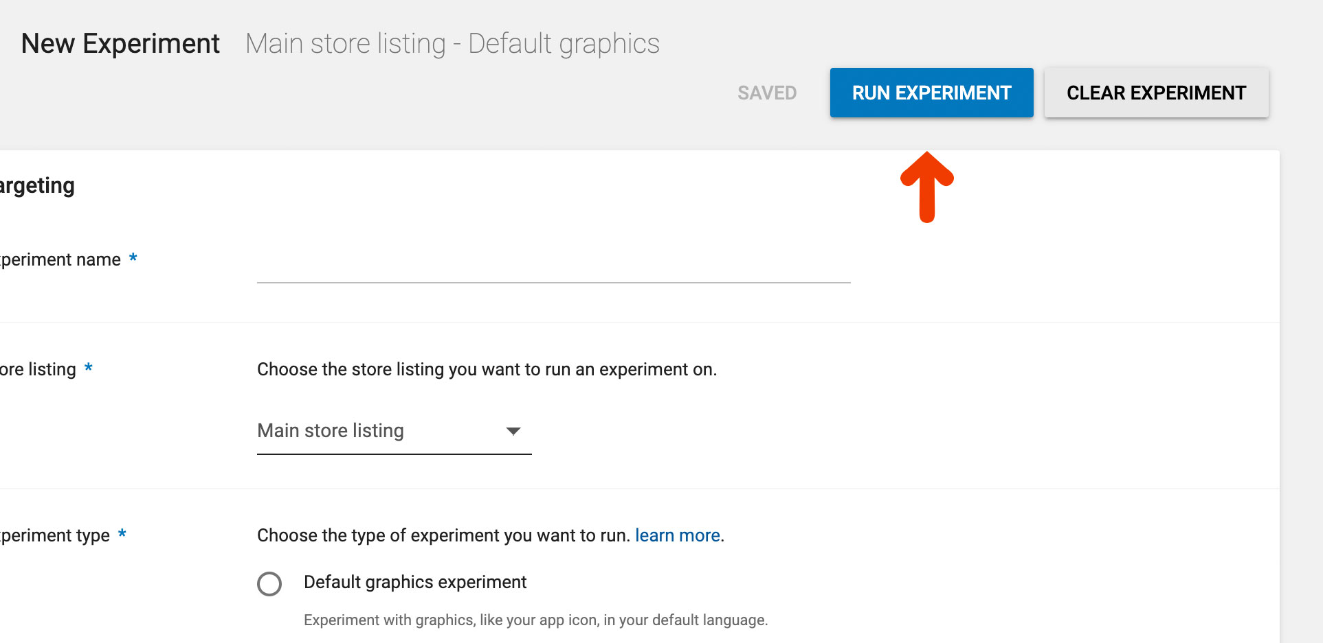
- Start the test by clicking the Run Experiment button at the top of the page. You'll probably need to scroll up for that.
Let it Run
Your test is live 🎉 Now comes the hard part — waiting for the test to gather data.
While you wait you can (and should) monitor how things are going. Google will show you how many downloads your A and B groups are generating by day and also how many of those stick around, which means they didn’t just download the app, they’re also using it.
If a test isn't generating the results you expected right away keep it going and give it more time, but if after a few weeks you're still not geting results you should probably go back to the drawing board. Also, if your test is generating negative results you'll want to end it and find a new change to test.
Choose a Winner
The simplest way to determine whether a change helps or not is to calcuate the conversion rate and pick the higher one, right? Yes, but... Because A/B tests are run short-term, usually for just a few weeks or less, we need a way to determine if a change that's performing now will also perform well in the future.
For that we turn to statistics, and speficially to statistical significance. Google automatically calculates Statistical Significance for you so we'll spare you the math, but if you really want to know check out this article.
We consider a test to be done when we have statistically significant results. Google will do that automatically as well and let you know when your test has enough data to make a determination.
Apply It
With the test completed it's time to choose a winner. The better conversion rate is the winner. If it's the original version just go ahead and end the experiment by clicking the Stop Experiment button at the top of the page. If the winner was your new change you'll want to make it permanent. Google will let you do that right from within the experiment.
What’s important is to make the change as-is and not to add any last-minute additions to it, which is something we tend to do once we see what works. If you have another idea for a change go ahead and create an experiment for it as well.
Continue Tracking to Confirm Results
Things like colors and tone have trends just like everything else, so it's important to always plan your next test but also keep a close watch on download trends. An easy way to do that is with email/Slack reports. If downloads don't continue to grow as you'd like take the time to set up a new A/B test.
Ideas You Should A/B Test Today
Here are a few ideas you can experiment with:
- Show your app in action vs screenshots - Create a set of screenshots that show people using the app and test it against a set that has more traditional app views showing your most unique features.
- Localize your captions and short description - This is the easiest way to tell if localizing will increase downloads. You can localize your short description or captions of your screenshots. If localization wins you may want to continue locaizing more elements (such as the app's name, which Google doesn't let you test).
- Place captions at the top vs bottom of screenshots - If you've read any of our other ASO guides you know captioning your screenshots is a must. There are a lot of things to experiment with when it comes to caption, but an easy one is to try placing them above the actual visual and pin that against the same set of screenshots but with the captions below.
- Use a high vs low contrast background color - Is your background stealing attention from your app? Try a high and low color pallete as an experiment, but remember to keep the actual visuals the same.
- Try a light vs dark icon - Similarly, you can experiment with your icon by having a version that's very light (white background) vs a dark version where the background is more colorful.
- Take screenshots in dark mode - Dark mode is becoming a critical feature for many users, so if you have support for dark mode put it on display in your screenshots and see if that increases conversion. Alternatively, you can add a single screenshot that talks about it if you don't want to go the experimental path.
- Reorder your screenshots - How you order your screenshots is also important. What you think might be the most important feature to show off with may not be. Experiment by having two different sets that are ordered differently, but make sure to use the exact same set of screenshots.
- Change the tone of your screenshot captions - The tone of the text you use is an often neglected element to optimize. With A/B testing you can safely try a few different tones (ex. excited vs direct) and see which yields more downloads.
- Change the tone of your short description - Similarly, you can experiment with the one of your short description, or go a step further and test the interplay between the tone of the short description and the tone of the captions, aligning and misaligning them.
There are many more things you can test, but a simple test is better than no test at all. Industry experts recommend running a test at any given time.
🚀 Get Ahead of the Competition
Want to get more downloads? Try our new suite of App Store Optimization tools to get ahead of the competition and increase your downloads. Get started →

