App Teardown - Color Widgets Has Some Opportunities

Welcome to App Teardowns, a series where we analyze the strategies apps and games use to gain visibility and downloads on the App Store and Google Play.
Widgets! That's right. iOS14 brought widgets to the iPhone, and they've taken the App Store by storm since the new OS rolled out less than two weeks ago.
With this release, a new type of app was born. Widget-first apps, which simply offer widgets. Just widgets. So far, several of those have skyrocketed to the top of the charts all around the world, earning more than 7 million downloads in their first week.
Where do you think people go to find these new widget apps? The App Store's search box.
In this Teardown, we're going to look at one of those overnight successes, Color Widgets, which is currently the #3 app in the US.
Hotness != great ASO. Color Widgets gets a B overall.
In this guide:
- Color Widgets by the Numbers
- The Competitive Landscape
- Keyword Analysis
- The Keyword List: What's Under the Hood?
- Where Else is Color Widgets Ranked?
- Screenshot Analysis
- Video Analysis
- Summary: So Many Opportunities
Color Widgets by the Numbers
Color Widgets was released with iOS14, under two weeks ago, but got off to an amazing start. Here's how it's performing in the US App Store, based on our Competitor Intelligence:
- 📈 786.3K estimated downloads since release.
- #️⃣ 7 in the Utilities category.
- ⭐️ 91% of new ratings were positive since it was released.
- 👋 Audience is young and leans male.
- 💰 Main competitors are also new and include a variety of widget-first apps.
The Competitive Landscape
Widgets are brand new to iOS14, but enough developers "knew" they could take off. And they did. Here are the top 5 widget-first apps in the App Store right now:

Color Widgets got a lot of downloads since launching, second only to category leader Widgetsmith. The top is pretty close, as users are exploring as many options as they can to customize their iPhones.
A few interesting highlights:
- Users seem to love Color widgets. It's been rated the most times so far and has the highest positive to negative ratio.
- Color Widgets is able to monetize just about 4% of its downloads (divide total revenue by IAP price after Apple's fee).
- Since PRO is a one-time unlock, Color Widgets gets just about $0.12/download, which means paid ads will be very hard to justify in the long term.
Accelerate Your Downloads
Discover new keywords, monitor ranks, and snoop on competitors.
Now that you have some context, you know how critical proper ASO is to Color Widgets.
Keyword Analysis
Let's kick off the analysis with the keywords Color Widgets' using in its name and subtitle. Those send the strongest signals to the App Store's algorithm.
- Name: Color Widgets
- Subtitle: Custom Widgets For iPhone
Strictly based on these, the algorithm sees the following keywords:
Let's take a look at where Color Widgets is ranked for these keywords:

Of all the apps and games I analyzed recently, this is probably one of the least good (for lack of a worse word) set. I'm going to chalk this one up to rushing the app to be there on launch day and cutting corners (been there, done that).
Not using all characters, unnecessary repetition, stop words, and even a mention of iPhone. Oh boy! Let's go back to the drawing board here... What sort of widget will I get? What can I customize? Those are the sort of questions a good name/subtitle should answer, and will likely end up hitting relevant keywords.
Widgets are hot now, but the ones that will win in the long run are those that dominate search results.
Takeaways:
- Take advantage of every character you can. That means 30 for the name and 30 for the subtitle.
- Repetition between the name and subtitle is ignored by the algorithm and is a waste.
- The algorithm ignores stop words such as "for" and also ecosystem words such as "app" and "iphone". Using them is pretty wasteful.
- The name and subtitle should answer the main question potential users have to drive conversion, which you can improve by using popular keywords. Not the other way around.
The Keyword List: What's Under the Hood?
Now, let's reverse-engineer the keyword list. The list isn't public, but we can attempt to uncover it by looking at all other keywords the app is ranked in. We believe it looks something like the following:
home,screen,ios,clock,time,widget,14,calendar,battery,photo,custom
That's a short but pretty focused list, and that's a positive. You don't see competitor names here, likely because this niche is all too new and when this list was set it was hard to tell who's the competition. That aside, this list does exactly what it should—it's focused on what you'll get from this app. A widget for clock/time.
I'd bring some of those keywords up into the name and subtitle but keep them in the keyword list as well. They'll need the extra strength as the competition becomes fiercer in the coming months.
Takeaways:
- Use the keyword list to describe what a user will get from your app.
- Try to take advantage of all 100 characters.
- Skip competitor names. They aren't very helpful to conversion.
Where Else is Color Widgets Ranked?
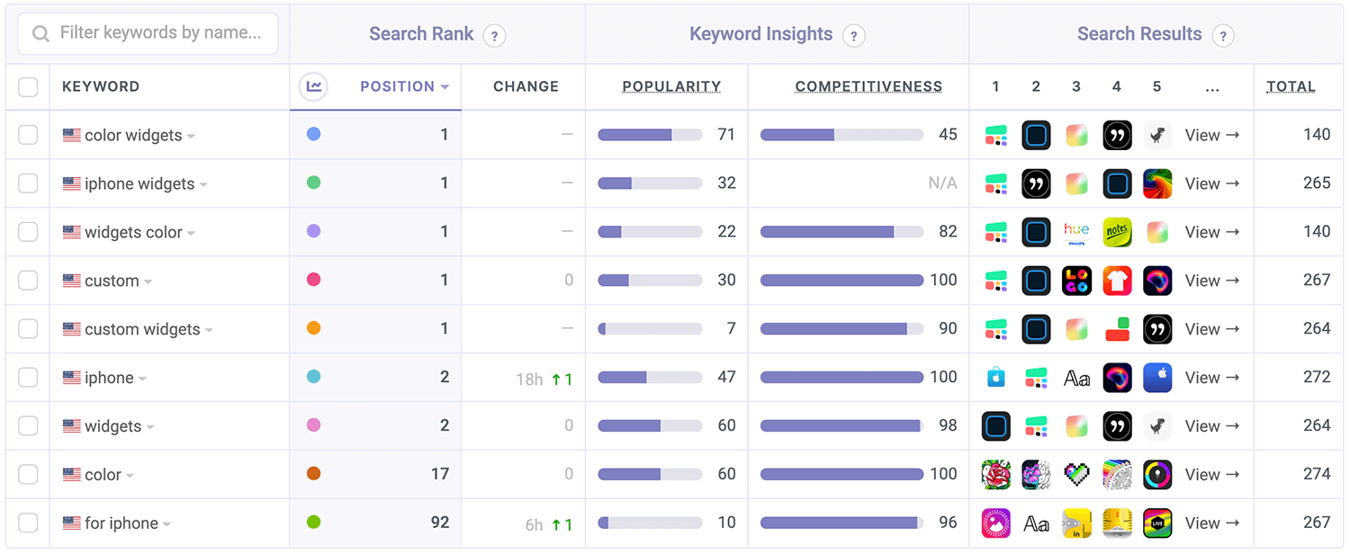
This combo of name, subtitle, and keyword list gives Color Widgets a bit more than just the name and subtitle alone. Here are some of the highlights:

Color Widgets is looking pretty good on keywords. Although the keywords it's targeting aren't broad, the algorithm has decided to rank it in a bunch of other keywords. Some relevant, some less so. This is common in cases where there aren't too many results for a keyword, such as for very unpopular searches, or for a very new type of app.
The table above shows the most popular keywords from the nearly 200 keywords the app is currently ranked in.
I expect ranking in these keywords will become more of a challenge as this niche matures.
Screenshot Analysis

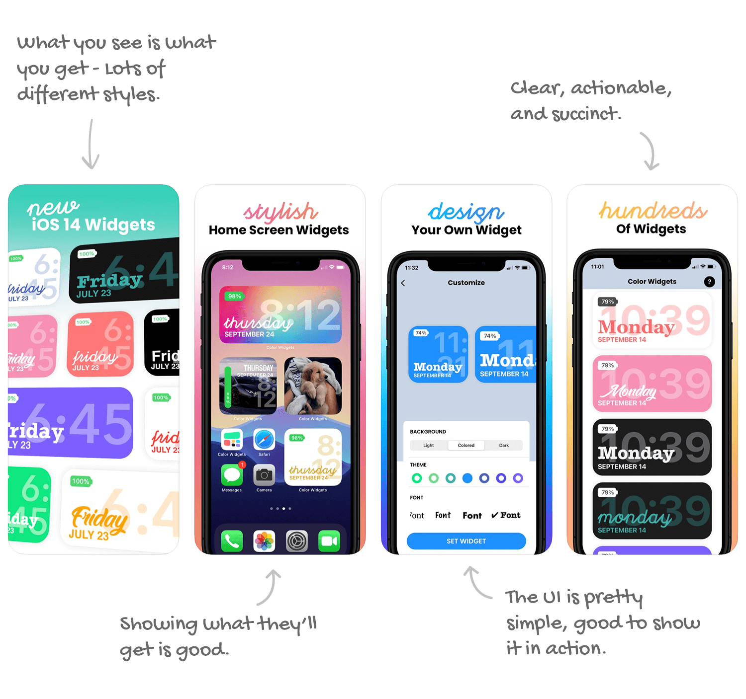
These aren't bad, but... they're not great. I have a feeling they were a bit rushed to get to be there on launch day, which is perfectly fine, but once the dust settles on widgets, I hope to see some improvements.
The narrow focus on this app makes it both easy and challenging to create the perfect set of screenshots. On the one hand, you don't want to be repeating things, but on the other, there are so many different outcomes (colors, fonts, layouts) that more screenshots can show.
What people enjoy looking at is very subjective. By showing them more options, you're more likely to hit one they like.
Takeaways:
- Apple lets you upload 10 screenshots. The more screenshots you use, the higher your chances of converting a view to a download.
- Contrast is king!
- Short captions are good, actionable captions are great.
- Showing the result of using the app, where applicable, is great for conversion.
Video Analysis
No video. Not a real surprise.
Widgets are very new, and to get to be the first most developers probably had to cut many corners. Marketing being one of the first to go...
However, widgets are a pretty visual addition, especially given the customizability which Color Widget touts. A video showing that, in action, can be very helpful as this niche grows and becomes very populated over the next few months.
Takeaways:
- A good App Preview video can help in a crowded niche.
- If you can, showing what the app provides can help seal the deal much more quickly.
Summary: So Many Opportunities
Widgets are new, they're sexy, and they're here to stay. Add all of that up, and you get a very competitive landscape. Color Widgets may have gotten a head start by being first, but the long game is won by having every possible part of the app's marketing optimized, and there's an array of opportunities here.
Time to Benchmark & Learn
Do you know how your downloads compare to your competitors? Which keywords they're using? Appfigures gives you the tools to answer those questions and many more. Outsmart your competitors and get ahead! Get started →

