16 A/B Tests You Must Try If You Want More Downloads


Being successful on the App Store and Google Play requires two things: 1. for people to find your app, and 2. for people who found your app to download it. That's right, not every person who finds your end will go on to download it.
You already know how to improve your visibility with keyword optimization, but how can you get more people who see the app to download it? The easy answer is by having the creatives (icons, screenshots, and a video).
But how can you tell if your creatives are right? That's where A/B testing comes in handy.
In this guide:
- What's A/B Testing & Why Do I Need It?
- 16 Easy A/B Tests You Have to Try Right Now
- How Many Variations Should You Test?
- How to A/B Test on the App Store & Google Play
- Did It Work?
- Nothing's Too Crazy
- Your Turn
- ASO Tools to Get Your More Downloads
What's A/B Testing & Why Do I Need It?
While there are best practices for creatives, one size doesn't fit all most of the time. Instead, those are great as a starting point. Why? Because different audiences have different expectations, preferences, and attention spans.
This means that you can spend a lot of time crafting the most beautiful screenshots, but they won't resonate with your audience, and instead of getting downloads, people will swipe back and check out a competitor.
A/B testing is a way of eliminating the guesswork by trying different versions in the "wild" for a short period of time to see which works best and then using the winner long-term.
16 Easy A/B Tests You Have to Try Right Now
By now, you should (at least) be curious about what kind of A/B tests you need to try for your app.
Here are 14 A/B tests you can run right now, on both the App Store and Google Play, for apps and for games, if you want to convert more page views into downloads. We also included examples to get the creative juices going.
Colors
Change the Background Color - Light vs. Dark
Contrast is key to creating good screenshots, but contrast can go both ways—Light on dark and dark on light. Take your screenshots and flip the foreground and background colors, and let that be your first experiment.
It's a super easy test to run, and even though it's really simple, it can improve your downloads.
Spice Up the Background - Solid vs. Pattern
Another easy test you can try for your background is to use a pattern instead of a solid color.
Homesnap, which we analyzed in season 2 of App Teardowns, uses clouds as a pattern:

Change the Color of Your Text
And the last test that involves colors is the color of your captions. If your screenshots don't have captions, that's also something you can test, but based on all of our experience, no captions = fewer downloads, so it's probably a test you can skip.
If the light background test you (definitely) ran won, you'll have more flexibility with text colors to test, but even if the dark background or pattern won, you still have some options.
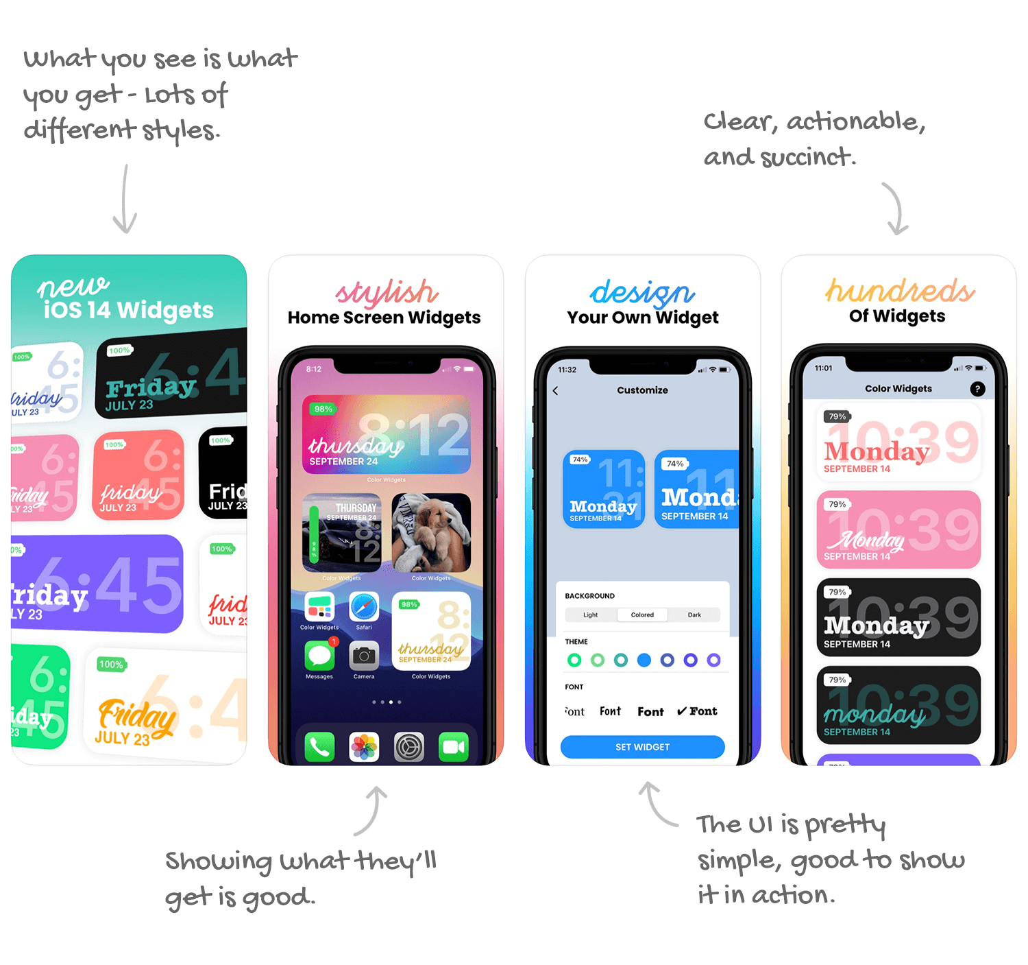
Color Widgets, which we analyzed in season 2 of App Teardowns, uses a selection of colors for its captions:
Text
Change the Style of Your Text
How you write your caption can also determine if a view will turn into a download and really depends on your audience, so it's a great item to test.
Pandora, the top-earning music streaming app we analyzed in season 2 of App Teardowns, uses a hand-drawn style for their captions:

Use Different Fonts
The fonts you use for your captions give them a "feeling," which could also make the difference between a download or a swipe back.
Rounder and chunkier fonts tend to feel friendlier, while thinner and more narrow fonts give the feeling of authority. Try them both and see what happens.
Grubhub, which we looked at back in season 1 of App Teardowns, uses a chunky font and bolds it to seem friendly:

Try Capitalizing Your Captions
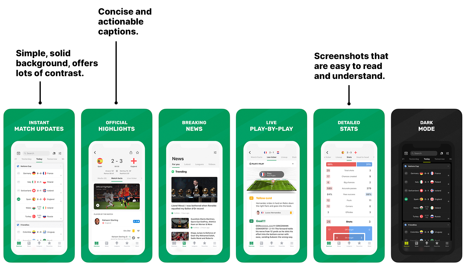
Another really simple test is the capitalization of your captions. The majority of apps don't capitalize their captions, but soccer score tracking app Fotmob uses bold and uppercase text
Change the Length of the Call To Action (CTA)
When it comes to captions, less is usually more, but one size doesn't fit all here as well.
If your current captions are long, try shortening them, and if they're already short (because you follow best practices), try giving them more definition.
The Weather Channel, which we recently did a Teardown of, is somewhere in-between short and long.

Change the Tone of the Captions
Tone, or the feeling that your CTAs convey, can have a direct impact on conversion.
Are your captions designed so that the reader feels good when reading them? Are they designed to instill fear of missing out?
Try various tones to see which one gets to a download more effectively.
Layout
Swap the Position of the Captions - Top vs. Bottom
Where you position your text is important. While common wisdom says to place text about the visual it's describing, that isn't always true. Try positioning the text above and below your other visuals.
Change the Size of Your Captions
There's so much we can experiment with when it comes to text!
When it comes to captions, the size of your font could matter, so try larger and smaller versions of your captions. This is another very simple A/B test you can run with minimal changes.
Robinhood, the trading app we analyzed in season 3 of App Teardowns, uses a large font to make the captions very easy to read.

Add More Space Around the Captions
Another easy test for captions is the space around the text and between it and the visual it describes as well as the border of the screenshot. More text makes it easier to focus on the caption, but takes away space from the visual it's describing.
We looked at TurboTax not too long ago and saw it gives its captions very lavish padding:

Try Single vs. Panorama Screenshots
Although screenshots are displayed with a space between them on the App Store and Google Play, some developers choose to "stitch" a few screenshots together to create a single visual using continuity.
"Panorama" style screenshots can be powerful in conveying a single feature or benefit, or in evoking an emotion, but come at the cost of multiple screenshots. Definitely worth A/B testing.
Todoist, which we analyzed in season 2 of App Teardowns, uses continuity in some of its screenshots to show the app can do a few things:

Change the Order of Your Call To Action (CTA)
Your screenshots should tell a story, but a story could be told in more than one way. Try shuffling the order of your CTAs, the captions you have on every screenshot, to highlight different features first.
Guide: How To Design Screenshots That Result in Downloads—Musts, Tips, and Don'ts
Landscape vs. Portrait Screenshots
You're probably used to seeing portrait screenshots for apps and landscape screenshots for (some) games, but that doesn't mean that's what converts best. Apps like Ultimate Guitar, which we looked at in season 1 of App Teardowns, use landscape screenshots to tell the app's story better:

Composition
Try Humanizing Your Screenshots
Most app screenshots don't show humans. However, most humans find imagery of other humans more friendly than of just UI. Try incorporating humans into your screenshots and test the difference.
It can be a hand holding a phone or a person in the app. Picasrt, which we analyzed in season 2 of App Teardowns, used pictures of people to show off the app's photo editor capabilities:

Show Off by Including Social Proof
This we don't see often (enough) but can quickly "sell" the app—Social proof.
Try including proof that your app is really great. If your app was featured, used that. If it was in the news, show those logos. If you got a raving review from someone very popular your audience would know, use that.
Spark Mail, which we analyzed in season 3 of App Teardowns, shows off both that it was App of the Year and that it was covered by popular tech publications:

Note: You'll notice we don't touch on videos (aka. App Previews) at all in this list. That's not because videos aren't "worth it" but rather because videos deserve an entire guide.
How Many Variations Should You Test?
Two.
The original version and another version. That's it.
Why? Because two variations, an A and a B, will split your page views in two and give each variation enough opportunity to get selected. Which really means your results will be more accurate faster.
You can certainly try more. I occasionally run tests with a C, and in some extreme cases even a D variation, but with those, the results are normally less definitive or take longer to accumulate.
I prefer two A/B tests vs. a single A/B/C/D test.
How to A/B Test on the App Store & Google Play
Alright, you're ready to test, have some tests in mind, and it's time to actually do it. But how?
Running A/B tests across The App Store and Google Play is a bit different because Apple and Google provide different tools.
-
App Store: Apple doesn't offer any built-in tools for A/B testing, so the best (and only) way to experiment is using a timed approach. Roll out version A to the store for a set time and track its results, and then switch to version B and track the results over the exact amount of time. 14 days is a good minimum, but 30 days is more appropriate for most apps and games.
-
Google Play: Thankfully, Google Play has built-in tools for A/B testing available right in the Google Play Developer Console, which you can use to set up a test and measure results in real-time.
Check out our guide for step-by-step instructions for A/B Testing on Google Play.
Did It Work?
The most important step you can't skip when experimenting is measuring the results. Your results are based on one important metric, and that's your conversion rate. To be more specific, the average conversion rate for at least 14 days before and after the experiment.
Measuring the average conversion rate over a set amount of time, the same time before and after, makes this process more accurate by allowing for days with better (or worse) organic traffic.
Nothing's Too Crazy
Experimentation is a mindset, not just a skill.
If you think about it like that, there isn't an experiment that's too crazy, and if you have an idea you think will work, it's probably worth experimenting with as long as you actively measure results. If you see things going negative fast, undo the experiment.
Your Turn
Easy, right? It may not seem that way right up front, but after you try this once and see results, you wouldn't want to stop. That's how it started for me.
I urge you to find the simplest test you can put together and give it a go.
ASO Tools to Get Your More Downloads
By the way, Appfigures offers all the tracking tools you need to understand the performance of your app or game across stores. We track your downloads, revenue, let you read and reply to your reviews, analyze your ratings, see your competitors' downloads, and much more.

